Christmas Recipe…

Hello my dear readers. This post is for my Christmas Recipe, which is really an extra credit activity.

I am not a huge fan of baking. I usually go out and buy Christmas cookies, or brownies, if I feel the need, but I am a huge fan of hot chocolate. Like a really big fan.  I love how filling a good cup can be, and  how quick it takes to make.

I especially love how hard it is to make a horrible cup of hot chocolate.

When I first saw the activity to design a Christmas recipe of my choice,  I knew I wanted to design a hot chocolate recipe.


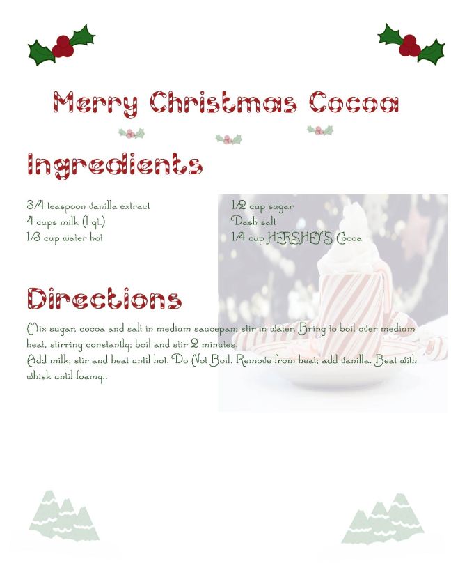
Here is my first try:

recipe with background


Although i really liked that design, I used indesign, photoshop, and illustrator for that first try.

The free vector water color image was priceless, and I absolutely loved the look. However,  I realized, that although the text, and watercolor images were technically vectors, neither of those counted as the right vector to use in the assignment requirements. I was a little disappointed, but I went to work designing a new recipe card for Hot Cocoa.

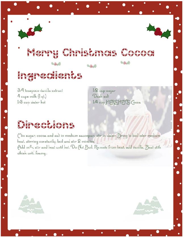
This was my second try:

Recipews_try 1


My own vectors were in that version, but I still did not like how the photograph was placed. I went back to work and created this:

Recipews_try 4

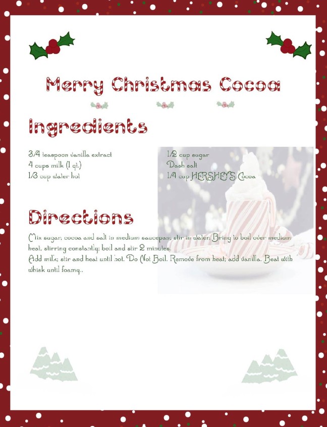
I loved how that last try turned out. There were vectors and everything was aligned nicely, but it still seemed to me, the design could use a bit more color.

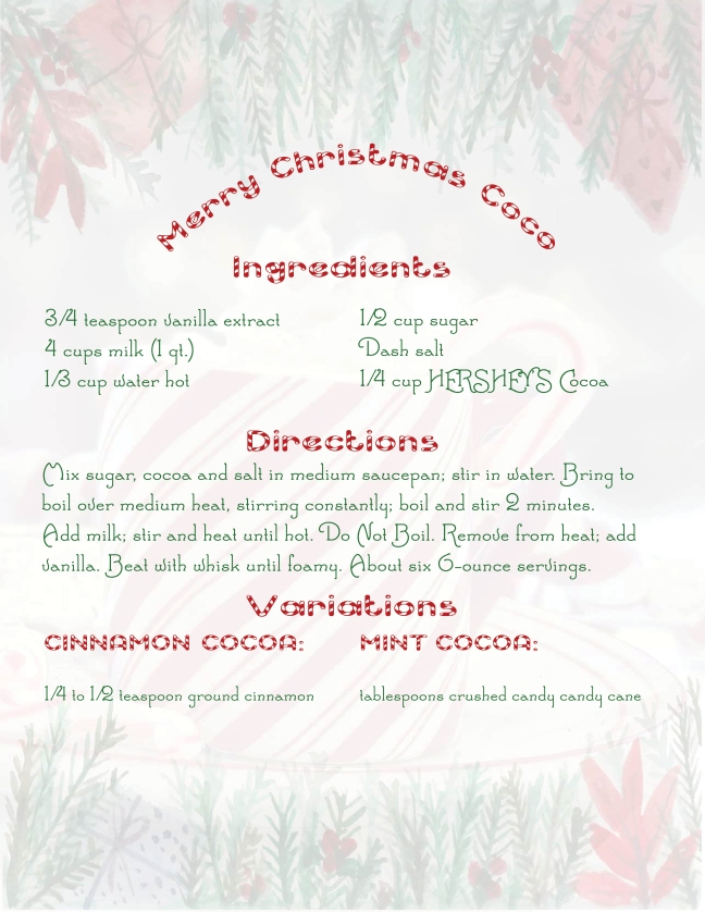
Next I tried putting in a background, to offset the stark white.

Recipews_try 5

I thought that design was really cute, but I wanted to expand the colors, so as to create more repetition in my design.

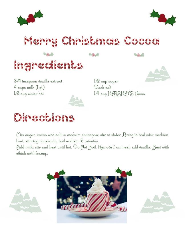
This is my final result and I really love how it turned out

Recipews_try 6

I will attempt to deconstruct my recipe card, as it pertains to design.

I will start first off, with my photograph of the hot chocolate.

IMG_0911

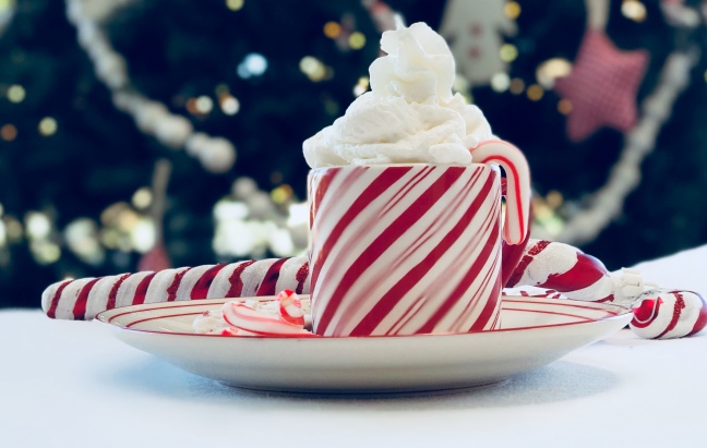
This picture was taken on the new Iphone 10 camera, I loved how the setting I used, made parts of the cup bury. I kept the blurriness, on purpose, because I like how it gave my photo an impressionistic feel.

Rule of Thirds

Rule of thirds, is probably my number one favorite photography/design technique, and I used that principle when I took the photo

Depth of Field

Another facet that I used in this photograph, was depth of field. I focused the camera lens on the cup, and let the other objects fade into the background. I love how the out of focus images, help to add to the impressionism.

Repetition

This is probably, and obvious one. I have a lot of color repetition in using the red and white Christmas theme, as I did my best to get the red star and white angel in the background of the photograph.

Contrast

Another obvious one is contrast, where the top of the photograph is darker than the bottom, since the Christmas tree is in the top background, and the table cloth is at the bottom.

Now I will return to deconstruct my Christmas Recipe.

Recipews_try 6

Audience

The audience for my design are retired women ages 68-85. Education is bachelors or post bachelor degree. The media consumption, are blogs and magazines.


Alignment

I was really careful about alignment in this assignment. I wrote the text, in Adobe Indesign. When I created the page, I made sure the guides were set to  2 rows, and 3 columns, to help me with the alignment.

I right aligned the picture of the hot cocoa, in Indesign, as well.  I thought it looked best, in that position, and I was able to align it according to the guides.

I also made sure to right and left align the two sets of ivy, and the two sets of Christmas shaped trees at the bottom of the recipe.

Rule of Thirds

The guides in indesign, and the rulers in illustrator, really were helpful to me, as I was able to use the rule of thirds, as a base point for the text setting.

Typography

I knew I wanted a Christmas-themed font style. I found the fonts on dafont.com. The font that I used for the header is called, Candy Cane, and the fonts for the ingredients and the instructions is called “Santa’s Sleigh.”

Repetition

Color repetition happens a lot in this design, as I use the three Christmas themed colors, green, red, and white. The color pattern occurs, in the ivy, the border, the type of fonts that I used, and the Christmas tree shapes at the bottom.

Proximity

I grouped the Christmas ivy at the top of the recipe, and the transparent Christmas trees on opposite ends of the recipe card, based on how the objects related to each other.

Contrast

One way I chose to show contrast was in how I left the bottom of the recipe card empty, except for the sets of trees. I think that the contrast helps balance out the information, and to the cleanliness of the design.

Attribution

I based the recipe off a recipe I love to use from this website. All other images, are produced by me, and cannot be used with attributing this blog. Thank you!

Conclusion: 

This was a very fun activity for me, and it was satisfying to actively create an activity from scratched, based on  principles of design. Even though all my past assignments were created with things like rule of thirds, typography, contrast, and proximity, in mind, this assignment seemed much freer in the sense that I was not limited in my choice of adobe products. Again, I used Indesign for the text, and the alignment of the photograph, in the recipe card. I also used illustrator, for the background, and the little illustrative ivy and trees.

Thank you for reading this post, and Happy Holidays to you!


Climb Every Mountain…

This class has certainly been a mountain, but there were plenty of resources, that helped me along my journey. For example, my instructor was really wonderful. She pushed me to my limits and helped me expand my definitions of terms.

The final project for my design class is a slide design. The project is supposed to be for an advertisement company, and I am supposed to engineer-critique their advertisement, then come up with my own advertisement, using some of the same techniques the advertisers used in the original ad.

So here is the original advertisement:

ADVETISEMENT THAT I;m using


It is a north face advertisement. I chose the North Face advertisement, because I really loved the cleanliness, and simplicity of the the mountain theme.

Audience

My audience for the advertisement, are single males ages 25-35. The education level being targeted, is masters or doctorate level, with an income level of $30,000-78,000. My audience’s media consumption are magazines.

For the actual slide design itself, the audience includes married men and women, ages 30-42, since it is supposed to be for a business corporation. The education level is masters of doctorate, and the income level between $30,00-$90,000.

Reverse Engineer of Advertisement

So, looking at the original advertisement I was able to pick out a few design techniques that I have been learning in this class.


Alignment/ Rule of Thirds

The alignment of the text and the photograph used in the advertisement  was the first thing I noticed. Speaking specifically, I noticed that the design incorporated the rule of thirds.

Depth of Field

I also noticed the photography in the advertisement used varying layers of depth of field. The depth of field, gives the advertisement a since of tone, emphasizing the most important parts of the ad.

Proximity:

Proximity in design means, that items that are related are grouped together. In this advertisement, the man and the boulder are grouped together and the logo, and the typography are both grouped together.

Similarly, the mountains that are lighter in color, as well as the light blue background, are grouped together and the darker colors at the bottom, not only illustrates proximity; it also shows contrast.


Contrast

The advertisement, uses the proximity of the lighter features and the darker features of the background landscape to contrast the top of the advertisement from the bottom.

Repitition

There is a slight hint of color repetition in the black fill of the typography and the dark pants of the model in the photograph.

New Advertisement Design:

This was the first time creating a slide with the adobe product, Indesign. I typically only use Microsoft products to make slides, so using Indesign was a bit unfamiliar to me. Thankfully, I was able to work through, and I am happy with the way my design turned out.

almosttheremasterpagesapplied


The slide design was a lot of fun to work on, for the most part, because it helped me review the things that I learned at the start of the semester. I tried to make sure the slide pages had several design techniques; I particularly focused on making sure my alignment was consistent.

almosttheremasterpagesapplied2

Audience:

The audience for my slide design includes married men and women, ages 30-42. The education level is masters of doctorate, and the income level between $30,00-$90,000.


almosttheremasterpagesapplied3

Message:

The massage I am trying to communicate through my advertisement is the desire to be out of doors, specifically, in the colder mountain regions, since this is an advertisement for North Face. I am trying to communicate that through using simple typography, and the rule of thirds and depth of field to focus my audience’s attention to the landscape inside of the advertisement.

almosttheremasterpagesapplied4


Color Design:

I chose a color scheme to match the photograph for the advertisement. One of the things that I struggled with, in my first draft of the slide design, was in using more graphics.

I had used colorized boxes, and it was pointed out to me, that I needed to use more grapics, in the design. I went online to pexels, and found an image, then I took that image into illustrator, and made it transparent. I then used the transparent image as a background, and that really helped make my slide seem more professional.

almosttheremasterpagesapplied5

Typography:

For my fonts I chose Avenir and Didot because I thought those seemed like very professional styles of font. I downloaded the two fonts from dafont.com.

almosttheremasterpagesapplied6

Alignment:

I followed a strict pattern of alignment, making sure to limit alignment of my text to the upper, left and right hand corners for the majority of the design.

I also used four columns, when I set up the page, and sticking to that really helped me nail the alignment in my slide design.

I also had a video call with my instructor, and she helped me understand how to make master pages. I recommend using master pages, because it ensures alignment consistency throughout the entire project.

almosttheremasterpagesapplied7

Repetition:

I tried to maximize color repetition, throughout the entire design. As I mentioned, a little bit, when I talked about the color design, I chose two colors from my new ad, and used those two colors to make the slides seem consistent with the advertisement.

almosttheremasterpagesapplied8

I also chose a stock image, with something red in it. I wanted to make sure the color match the Logo, and I think I was able to accomplish that, with the model in the red jacket.

Also in the way of repetition, I used a 4 px stroke width, for my draw-overs, so there is some consistency, and repetition, there throughout the slide, as well.

almosttheremasterpagesapplied9

Attributions

At last, I would like to give credit, where credit is due. I found the North Face Advertisement by doing an internet research. I found the advertisement here

I found the stock photography for my advertisement on pexels, here. I transformed the image in illustrator, because I wanted my ad to look very different from the original.

I also found the background on pexels here.

I purchased a mock-up for my last slide, here.

Conclusion:


I found that these simple little design techniques have helped me improve things, like snapping a simple picture on my phone; it’s wonderful being able to capture a memory, in a way that reflects the spirit of the moment. Even though some  techniques, like depth of field, are  things I always did when I took a picture,  I did not know what I termed “zooming in” was called actually called depth of field. I also did not know that aligning subjects in the rule of thirds, would make for a better photograph. I am also much more aware of what I am doing, when I design around my house. For example,  I even used the techniques when I decorated my house for Christmas. One thing I love about design, is that I can use the techniques to beautify the lives of my family.

I am happy that I was able to share with you, a portion of what I did throughout the semester. I hope my little posts, encourage you to use some of these techniques in your own creations. I want to thank you for reading about my slide design post. I had a lot of fun designing it, and I hope you had a lot of fun reading this article, too.