Hello my dear readers. This post is for my Christmas Recipe, which is really an extra credit activity.
I am not a huge fan of baking. I usually go out and buy Christmas cookies, or brownies, if I feel the need, but I am a huge fan of hot chocolate. Like a really big fan. I love how filling a good cup can be, and how quick it takes to make.
I especially love how hard it is to make a horrible cup of hot chocolate.
When I first saw the activity to design a Christmas recipe of my choice, I knew I wanted to design a hot chocolate recipe.
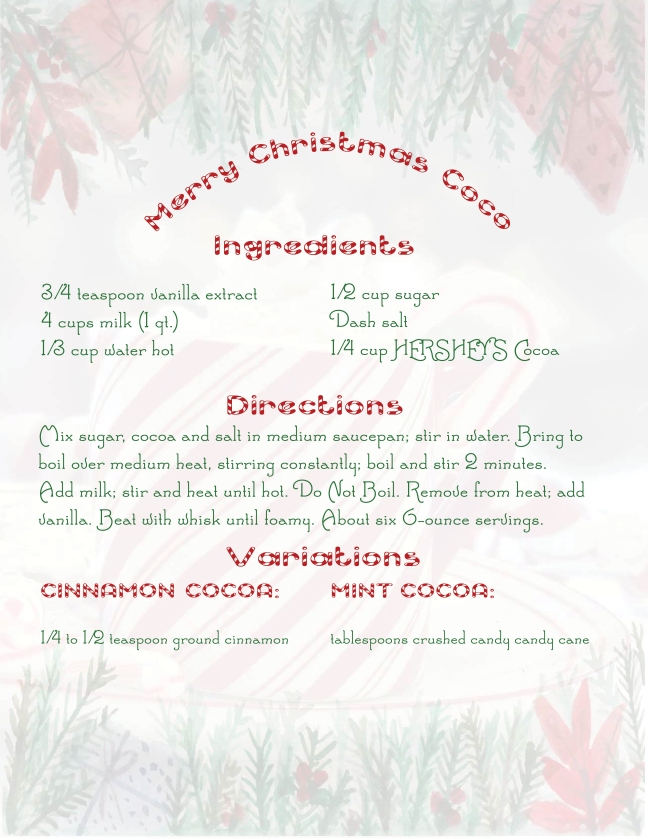
Here is my first try:

Although i really liked that design, I used indesign, photoshop, and illustrator for that first try.
The free vector water color image was priceless, and I absolutely loved the look. However, I realized, that although the text, and watercolor images were technically vectors, neither of those counted as the right vector to use in the assignment requirements. I was a little disappointed, but I went to work designing a new recipe card for Hot Cocoa.
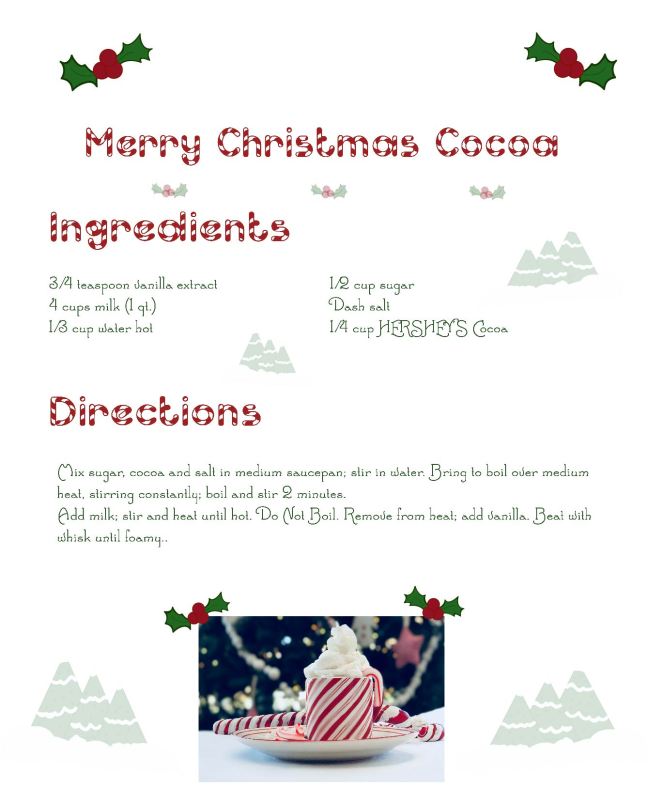
This was my second try:

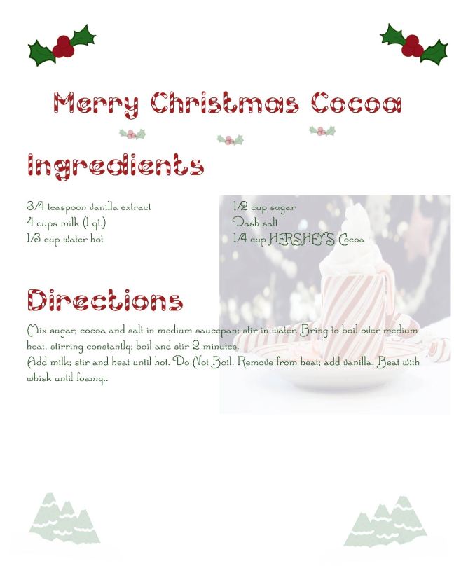
My own vectors were in that version, but I still did not like how the photograph was placed. I went back to work and created this:

I loved how that last try turned out. There were vectors and everything was aligned nicely, but it still seemed to me, the design could use a bit more color.
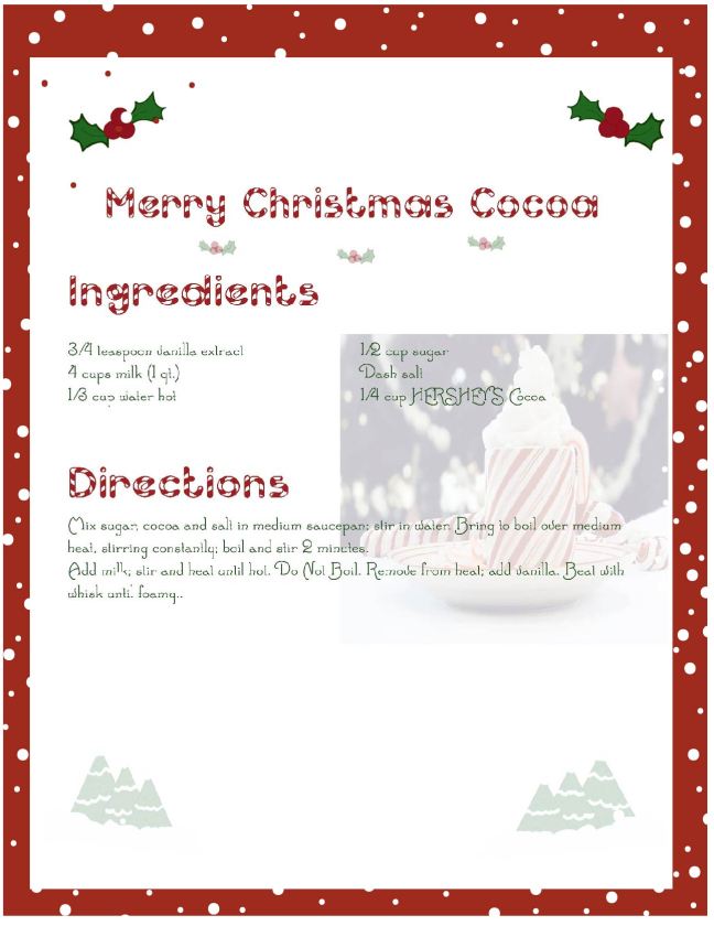
Next I tried putting in a background, to offset the stark white.

I thought that design was really cute, but I wanted to expand the colors, so as to create more repetition in my design.
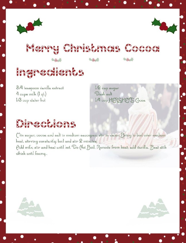
This is my final result and I really love how it turned out

I will attempt to deconstruct my recipe card, as it pertains to design.
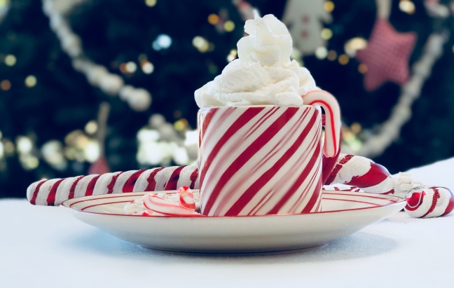
I will start first off, with my photograph of the hot chocolate.

This picture was taken on the new Iphone 10 camera, I loved how the setting I used, made parts of the cup bury. I kept the blurriness, on purpose, because I like how it gave my photo an impressionistic feel.
Rule of Thirds
Rule of thirds, is probably my number one favorite photography/design technique, and I used that principle when I took the photo
Depth of Field
Another facet that I used in this photograph, was depth of field. I focused the camera lens on the cup, and let the other objects fade into the background. I love how the out of focus images, help to add to the impressionism.
Repetition
This is probably, and obvious one. I have a lot of color repetition in using the red and white Christmas theme, as I did my best to get the red star and white angel in the background of the photograph.
Contrast
Another obvious one is contrast, where the top of the photograph is darker than the bottom, since the Christmas tree is in the top background, and the table cloth is at the bottom.
Now I will return to deconstruct my Christmas Recipe.

Audience
The audience for my design are retired women ages 68-85. Education is bachelors or post bachelor degree. The media consumption, are blogs and magazines.
Alignment
I was really careful about alignment in this assignment. I wrote the text, in Adobe Indesign. When I created the page, I made sure the guides were set to 2 rows, and 3 columns, to help me with the alignment.
I right aligned the picture of the hot cocoa, in Indesign, as well. I thought it looked best, in that position, and I was able to align it according to the guides.
I also made sure to right and left align the two sets of ivy, and the two sets of Christmas shaped trees at the bottom of the recipe.
Rule of Thirds
The guides in indesign, and the rulers in illustrator, really were helpful to me, as I was able to use the rule of thirds, as a base point for the text setting.
Typography
I knew I wanted a Christmas-themed font style. I found the fonts on dafont.com. The font that I used for the header is called, Candy Cane, and the fonts for the ingredients and the instructions is called “Santa’s Sleigh.”
Repetition
Color repetition happens a lot in this design, as I use the three Christmas themed colors, green, red, and white. The color pattern occurs, in the ivy, the border, the type of fonts that I used, and the Christmas tree shapes at the bottom.
Proximity
I grouped the Christmas ivy at the top of the recipe, and the transparent Christmas trees on opposite ends of the recipe card, based on how the objects related to each other.
Contrast
One way I chose to show contrast was in how I left the bottom of the recipe card empty, except for the sets of trees. I think that the contrast helps balance out the information, and to the cleanliness of the design.
Attribution
I based the recipe off a recipe I love to use from this website. All other images, are produced by me, and cannot be used with attributing this blog. Thank you!
Conclusion:
This was a very fun activity for me, and it was satisfying to actively create an activity from scratched, based on principles of design. Even though all my past assignments were created with things like rule of thirds, typography, contrast, and proximity, in mind, this assignment seemed much freer in the sense that I was not limited in my choice of adobe products. Again, I used Indesign for the text, and the alignment of the photograph, in the recipe card. I also used illustrator, for the background, and the little illustrative ivy and trees.
Thank you for reading this post, and Happy Holidays to you!


